1.2. Exact Calculation, or Bound?#
All of the questions we asked in the previous section could be answered based on the information given. But sometimes the information at hand is not enough for us to be able to find the probability of an event of interest. Let’s look at an example of this and then see if there is anything useful we can say in situations where we can’t find an answer exactly.
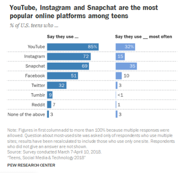
As a reminder, here is the Pew Research Center graphic again. The experiment is to pick one teen at random from the population represented in the charts.
1.2.1. Facebook or Twitter: Question 1#
What is the chance that the selected teen used Facebook or Twitter most often?
This question has an exact answer based on the right hand chart. Each teen is in exactly one bar of that chart. The teens who used FB most often are an entirely distinct group from those who used Twitter most often.
Here is a Venn diagram representation of this. The number shown in each disc is the percent of teens in that category.
If you think of proportions as areas (a very good idea, as you will soon see), the green area is the proportion in question: the proportion of all teens who used FB or Twitter the most. The area is clearly 13% because there is no overlap between the two discs.
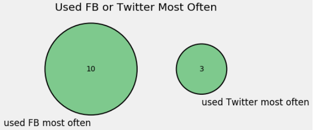
Because the discs are disjoint from each other, the answer for a randomly selected teen is
1.2.2. Facebook or Twitter: Question 2#
What is the chance that the selected teen used Facebook or Twitter?
The left hand graph says that 51% of the teens used Facebook and 32% used Twitter. If we try to draw a Venn diagram that represents this, we run into a problem. Some teens might have used both Facebook and Twitter, and we don’t know the percent in this group.
So the first point to note is that there is not enough information to find an exact answer to the question.
That’s life. We usually have incomplete information and thus there are many questions that we can’t answer exactly.
But let’s not just throw up our hands. Let’s see if there is anything more that we can say about the chance other than, “We can’t find its exact value.”
1.2.3. Bounds#
When we can’t find the exact value of a chance, we can instead try to place some bounds on it.
One pair of bounds is easy: the chance is between 0 and 1 (or 0% and 100% if you prefer).
While this is doubtless true, it is not particularly useful. Can we do better?
For this we should examine where we got stuck.
We want the percent of teens who used Facebook or Twitter.
We know that 51% of teens used Facebook and 32% used Twitter.
But we can’t draw a Venn diagram because we don’t know the extent of the overlap between the two groups. That is, we don’t know the percent of teens who used both platforms.
How big could the overlap be?
The largest possible overlap would happen if every teen who used Twitter also used Facebook.
The smallest possible overlap would happen if no teen used both Facebook and Twitter.
Both of these possibilities are unrealistic but they are theoretically possible. They are represented as Venn diagrams in the discussions below. Remember that in all the diagrams, the green region corresponds to teens who used either Facebook or Twitter.
1.2.4. Lower Bound on the Chance#
The percent of teens who used Facebook or Twitter must be at least 51% because the group includes all those who used Facebook. So the chance that the selected teen used Facebook or Twitter must be at least 51%.
Here is a Venn diagram of the extreme case when every teen who used Twitter also used Facebook.
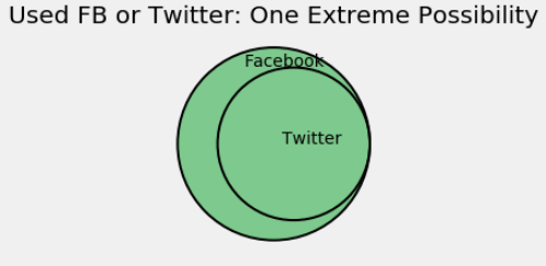
In this diagram, the area of the green region is 51%. It is the same as the area of the Facebook region because the Twitter region is completely contained in it.
1.2.5. Upper Bound on the Chance#
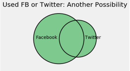
The diagram below shows the other extreme, when the group that used Facebook is entirely distinct from the group that used Twitter.
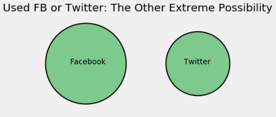
In this diagram the area of the green region is 51% + 32% = 83%.
That’s the biggest that the chance can be, because the other possible Venn diagrams look something like the one below and thus have a smaller green region.
We have shown that the chance that the randomly selected teen used Facebook or Twitter is at least 51% and at most 83%.
Though we don’t have an exact value for the chance, we have done much better than just saying that the chance is between 0% and 100%.